SAP - Project Execution
Duration February 2013 - April 2014 (last working day)
Resources Product Website
Responsibilities
- Translated SAP-system GUIs into responsive web equivalents by fusing new platform potential with product functionalities and objectives in the real world.
- Being one of the early front-runners in designing the central UI design guidelines, we formulated UI control requirements based on use-cases relevant to not just our applications but also other products that were looking to adhere to this evolving library.
- Provided UI specs as well as tested the final implementations before every release.
- Translated synthesis of customer feedback into proofs of concepts for future releases.
- Actively involved in bug-fixing and raising UI tickets post-release.
Problem Statement
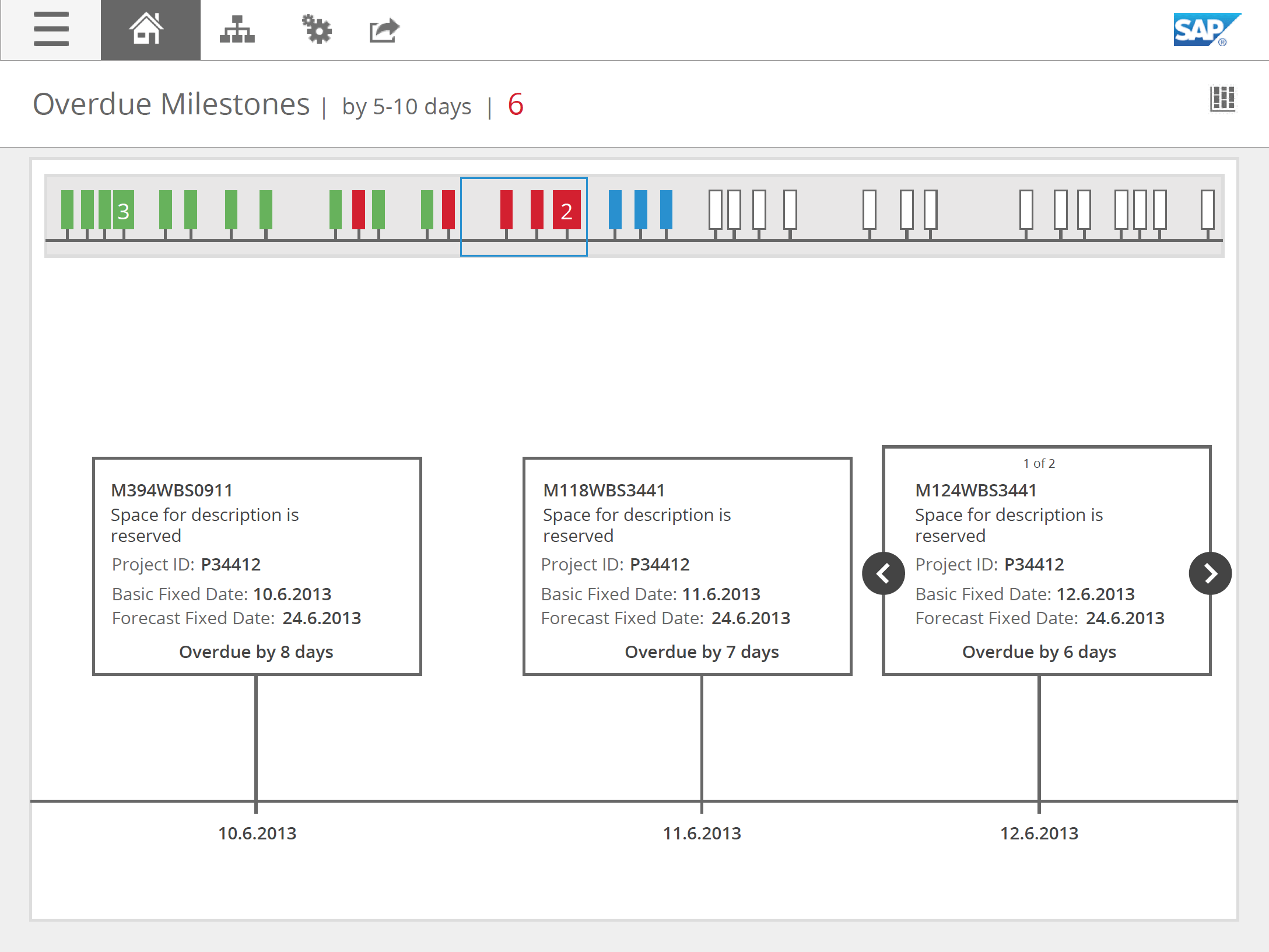
I had designed for 10 applications in the product. Some key use cases were - a project manager having an overview of project progress within one and across multiple projects, a project manager viewing how project milestones have been completed, a project manager viewing how delays might affect her project. Shown below is one of my earlier concepts for representing milestones.
Approach
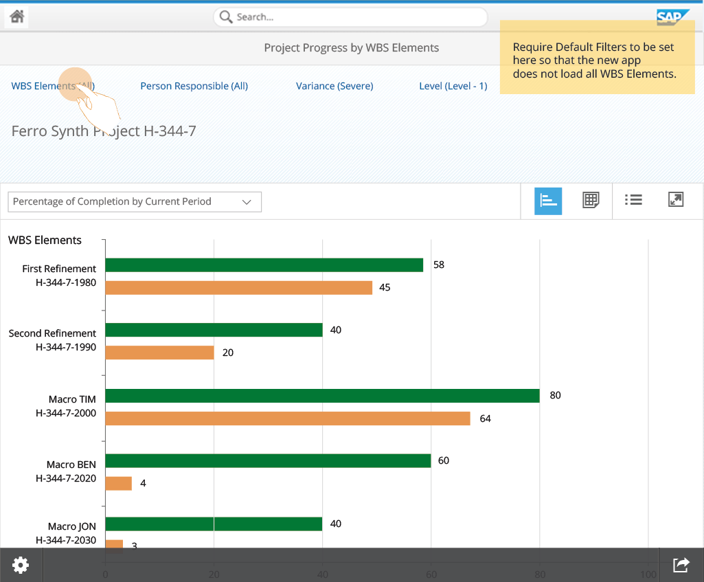
Adopting the new Fiori UI library both freed and constrained our approach. Since our product was one of the early adopters, we were able to propose design of new UI elements that could be used across other products. It also meant that the previously different representations had to be redrawn - for example, how would apps look like if there were allowed only two levels of navigation?
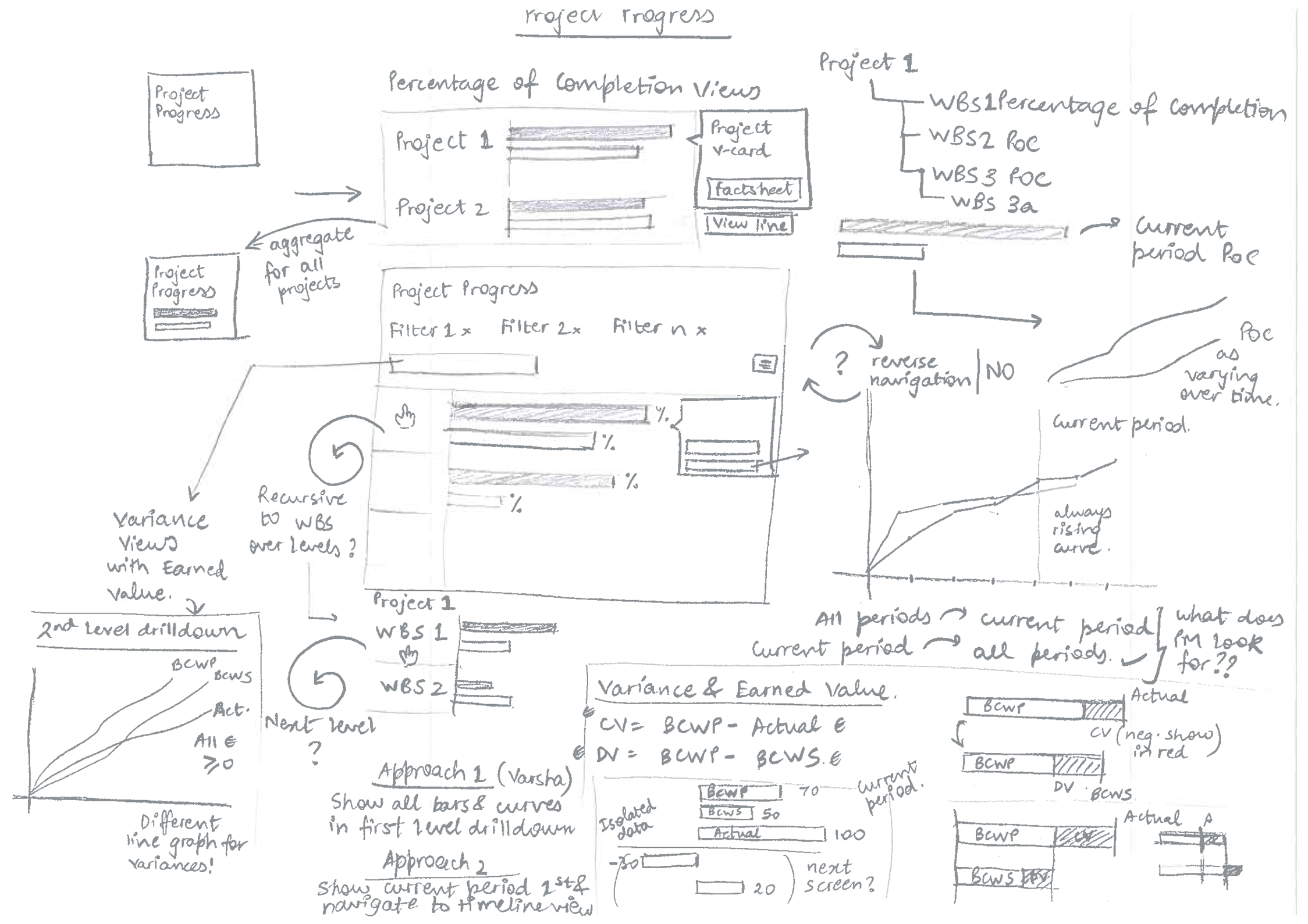
My co-designer and I constantly aligned with each other and with other early adopters to make sure that most UI controls have enough flexibility to fit into multiple use cases with little engineering effort. This required us to also be in sync with the engineering team. Another challenge was also to improvize using other existing controls when the proposed UI elements despite critical were not feasible. In the mockup below, we contributed to additional modifications to the bar chart controls.
Design Thinking
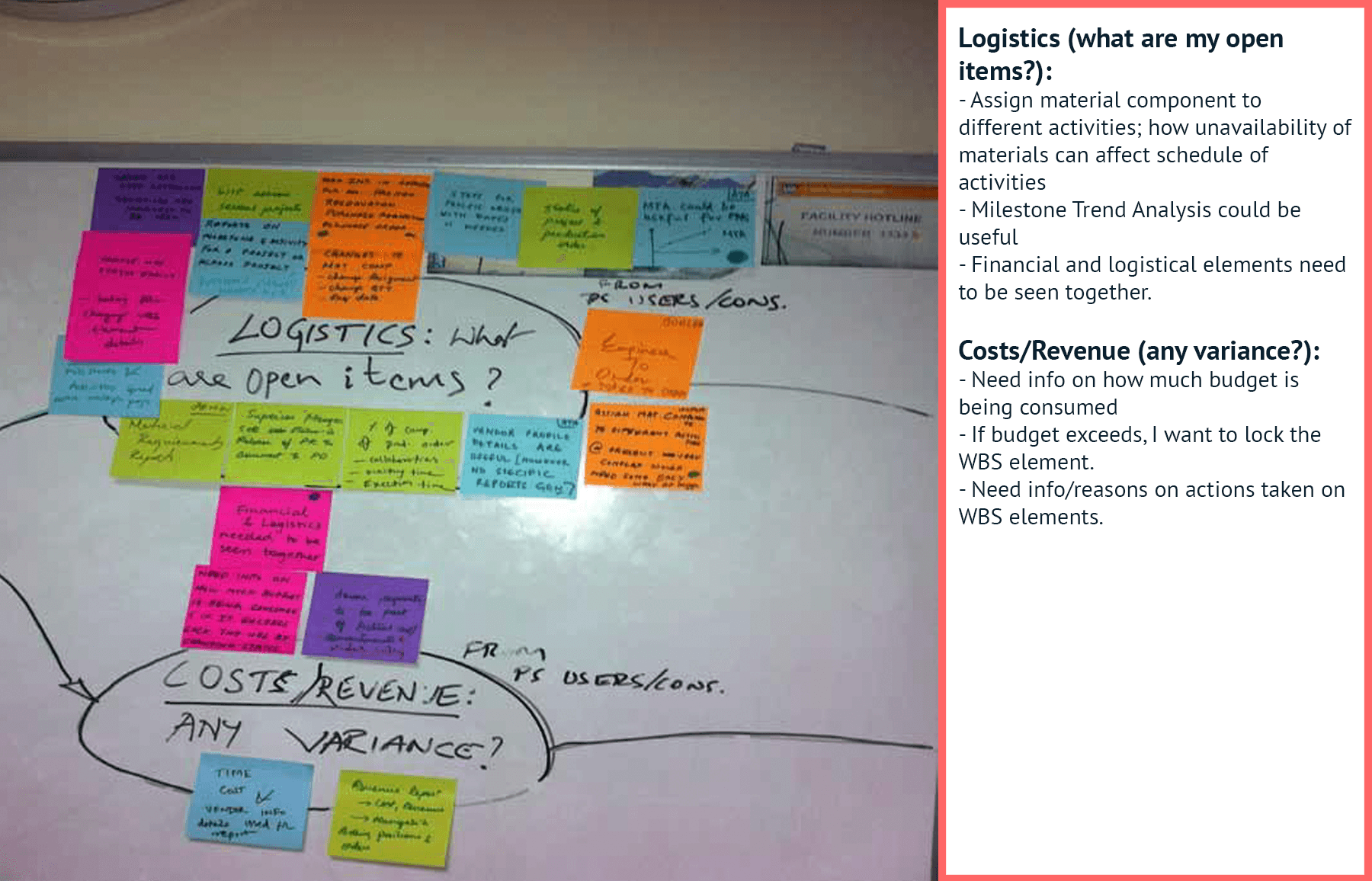
In parallel to our design efforts, our team also conducted a Design Thinking exercise to bring together the whole team to a common understanding. My co-designer was involved with interviewing stakeholders in Germany while I led the synthesis of the insights from the Bangalore office. We mapped various issues using affinity diagramming, clustering based on which part of the project lifecycle did they occur in.
Mockups
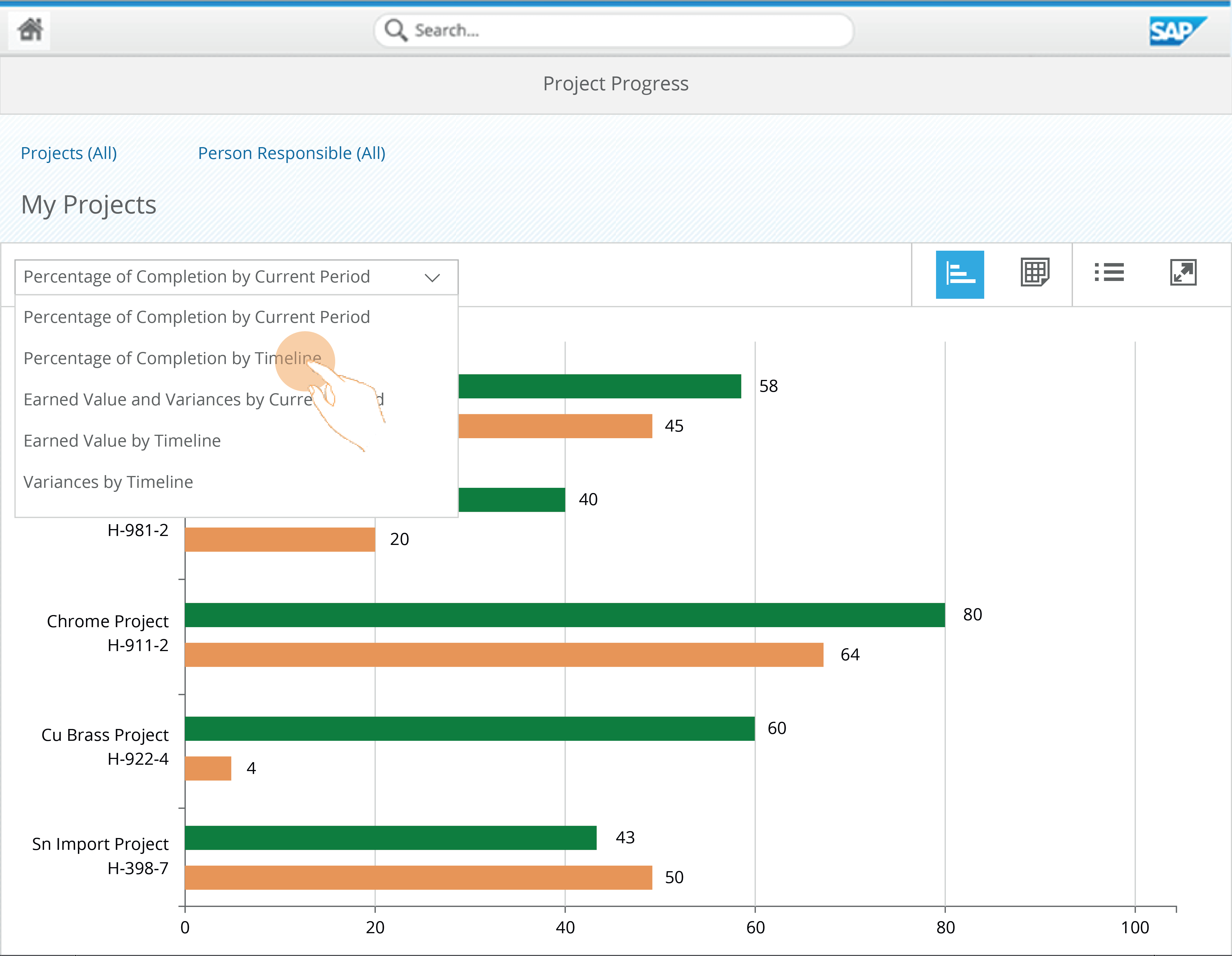
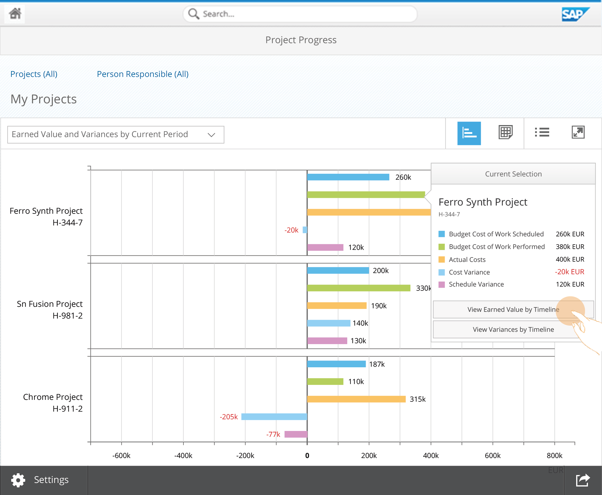
The redesign into Fiori also gave us an opportunity to rethink business requirements - does it allow us to add or take away features if necessary? For example concept of defaults that I introduced below worked well both in the new UI patterns as well as fulfilled an unexpressed business need.
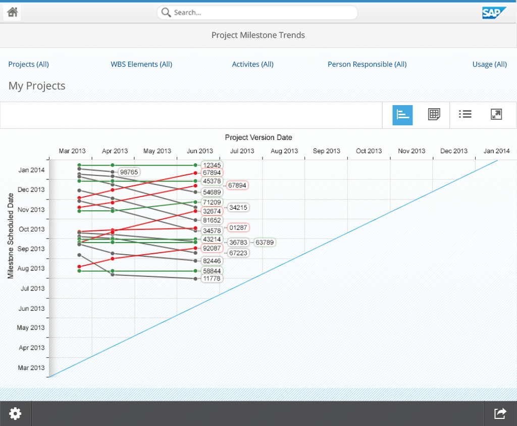
In the situation below, I had to make the case for new controls such as a trend analysis chart. This required modifications to the existing line chart library so that it allowed changing the orientation of the axes, allowing tooltips to responsively align themselves since there are likely scenarios of more than 30 milestones in one chart, and also bearing visual similarities to conventional MTA charts.
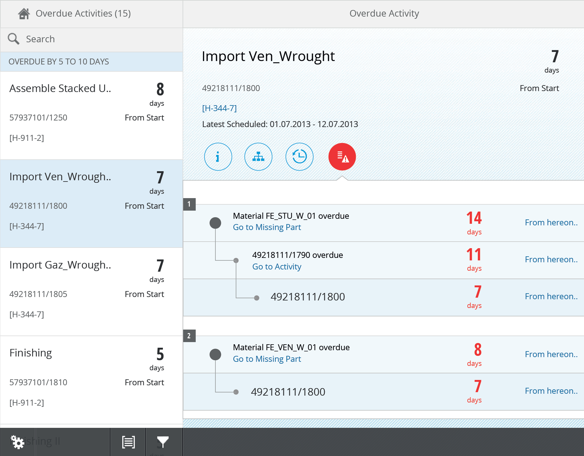
Finally, as a result of the design thinking exercise conducted, I had come up with a proof-of-concept that allows a project manager to foresee serious delays in future because of trivial unavailability of resources in the present.
Insights and Challenges
The synthesis stage of the Design Thinking was a very efficient platform to bring together visions of the product from the perspectives of managers, developers, architects and product owners and how they would have done things differently.
Despite its long development lifecycle, my teammate and I worked in an intense agile work environment owing to radical UI changes to add to the library, while, at the same time designing for future releases that incorporate customer feedback. This was a major source of design dilemmas.
At times, it was difficult to understand if a user’s acceptance of terminologies and models from an old legacy interface was considered relevant to retain in a newer design. While newer interpretations on paper could have been better, this was not established through user-testing.
Product owner feedback
"Ganesh has proven his ability to quickly understand the business context and use case and to turn rather fuzzy ideas and requirements into concrete and well structured ideas for visualisation and navigation. He made sure to focus on simplicity and usability without dropping any of the mandatory features. Ganesh took full responsibility for his tasks and work while staying an agile team player at the same time."
Next project
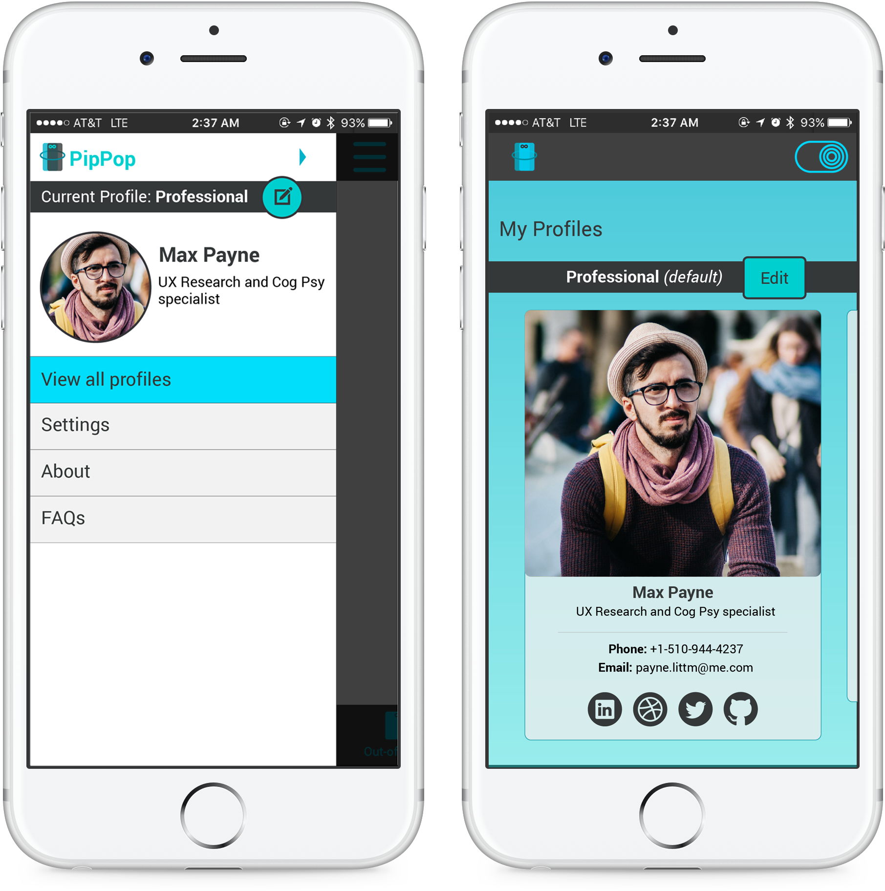
PipPop - Exchanging contact information seamlessly
Key aspects Designing to break precedent, user security and privacy, multi-modal interactions